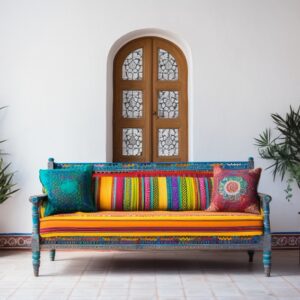
You must decorate and design the walls of your home are the most valuable property. They cover most of the area, instantly drawing your eyes to them. So it’s only natural to wear colors and patterns that instantly make a statement!
You must remember the rich quality of arousal, bold patterns, colors, and even textures in ways that paint can’t easily. While it may exhilarate you to try out a bold new wall covering, you may need more time to choose furniture and accessory colors to match it. While it may seem difficult!
But if you plan to install wallpaper, take a look at these tips to help make matching your decor to your wallpaper that much easier.
Ideas to Choose Colors For Wallpaper Matching
1. High contrast with a hint of color
If your design style is an instant awestruck factor when guests enter your room, opt for a high-contrast color with your wallpaper color. Take paint or fabric swatches and find contrasting colors with bright or powerful saturation to create an electrifying space that reflects your eclectic design style. A wonderful way to match colors is to use a color wheel, which indicates the entire spectrum of colors. Colors across from each other will contrast well, while colors close to the wheel will complement each other. If in doubt, visit a home improvement or craft store and look for swatches and swatches of complementary colors.
2. Subtle color with bold and inspiring patterns
While you may love the bold patterns, you may prefer something else to the high-contrast design style of bright colors. Don’t worry; lighter colors with a mix of bold patterns that also utilize more subtle patterns are still attractive. Look at your bathroom that uses floral branches and a light blue to create a light and airy feeling throughout the bathroom. Coupled with a high-end finish like marble, it makes a room that isn’t too overbearing and is instead comforting and calm. Refrain from being intimidated by using bold wallpapers; choose a wallpaper color and replicate it in the surrounding materials, finishes, and decorative accents.
3. Use colorful wallpaper as a backdrop
Many homeowners think wallpaper and color should take center stage in their interiors. By contrast, bold wallpaper looks beautiful behind large furniture or on a wainscoting wall. Less is often more, and choosing a color from the surrounding furniture will help to tone down the overwhelming nature of your wallpaper. Choose colors that feel reasonable and will work wonderfully with your wallpaper! Look at your bookcase that uses wallpaper to line the back of the wardrobe. This technique helps you obtain a visual interest in your wardrobe while weaving in subtle colors without catching the eye.
4. Choose the most dominant color
While you may have thought choosing colors to match your bold wallpaper was tough, these few tips should motivate you to go ahead and create your magic in your interiors. Before you tell yourself that that won’t work, get creative and decide if you want it subtle or dynamic. Whatever you choose, get going; your beautiful walls await you!
5. Choose an accent color on the wallpaper
If you want to choose something other than the most dominant color in your wallpaper to act as the primary color in the rest of your decor, another option that can still result in a blended look is to use an accent or secondary color in your wallpaper. Try to use the accent color in your wallpaper as the base for your color palette instead of the more dominant color can create an unexpected look in your final design.
6. Go with an unsuitable look
Instead of matching your wallpaper, another brilliant option is to deliberately make your wallpaper mismatch with the color palette of the rest of the room. While this type of mismatched look can be more difficult to achieve, it’s a great way to give a room an eclectic, bohemian feel.
7. Use tertiary colors for subtle, soft tones
Tertiary colors are the colors among the primary and secondary colors; these include colors such as yellow-green, blue-green, or red-violet. Tertiary colors are excellent for introducing jewel tones into your interior design in a muted way that can make them a better choice for quiet spaces like bedrooms and bathrooms.
8. Bring in jewel tones for a wealthy look
Opt for darker or muted neutral wallpaper. A dramatic option might be to bring the furniture in rich jewel tones like crimson or indigo. Metallic accents can add a rich art deco aesthetic for even more sophistication.
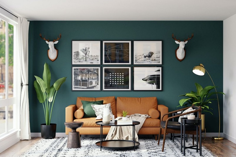
9. Use the same color all over the room
One of the best methods to make the most of a bold wallpaper is to bring the same dramatic color in the wallpaper to the rest of the room as well. You can apply different shades of the same hue to help break up the room design’s appearance and add some visual interest.
10. Use cool colors for drama and calm
Apply cool colors are some of the most versatile colors that you can use in your wallpaper and the décor. In rich tones, cool colors are dramatic and mysterious. In muted or pastel tones, cool colors give a calm sense.