
When it comes to putting a personal stamp on your home, nothing does the job quite like paint. Simply by picking a different color for the walls of the living room or kitchen, you can totally transform its look and feel. You can increase curb appeal of your home with paint. The only problem? It can be tough to know what colors create which environment. How can you pick paint colors that reflect your personality, while also making a house feel more like home? What are the secrets to selecting paint colors you’ll love for the long haul? One resource that can help with answering these questions is paint color theory.
Let’s Picking Right Paint Colors for Your Home
Whether you’re rethinking the décor of a home you’ve loved for years or you’ve just moved into a new place and want to refresh its style, here’s a look at how color theory can help.
What Is Color Theory?
Simply put, color theory is the science of what colors do — how they make people feel and what they change about the vibe of a space. When it comes to home interior painting, you can use the principles of color theory to identify what certain colors do and then pick shades according to your goals for certain rooms. Essentially, anytime you’re on the fence about which direction to go in for paint colors, starting with the psychology of color can help.
Warm and Cool Colors
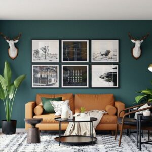
Take warm and cool colors, for example. While you may feel drawn to both blue and red or green and orange at different times and for various reasons, it’s important to understand, as paint colors, they connote different things in a home. Warm tones like red and orange stimulate and increase energy, for example. This makes them great for highly social spaces such as the kitchen or the living room. Cool tones like blue and green, on the other hand, calm and encourage concentration, so they work well in offices and bedrooms.
The Color Wheel
Another way color theory can be helpful is for planning color schemes. The traditional color wheel shows the relationships between various colors. For example, dark green, light green and yellow neighbor each other and thus work well in what’s known as an analogous scheme of harmonious, related shades. Dark blue and orange, on the other hand, sit opposite one another on the color wheel, showing how they are complementary colors. Typically, you’ll want to create analogous color schemes in places where you want a unified, calming vibe. Complementary color schemes are better for rooms where you want vibrant combinations with high contrast. Another option is the monochromatic color scheme, in which you choose one color, but at various saturation levels; this can create an elevated, professional style.
More Guiding Principles for Color Selection
As you think through various parts of your home and how you use them, you’ll typically find yourself leaning towards a particular color or color family. Here are some more tips to keep in mind as you plan:
- Pay attention to what you like: In the inspiration-gathering stage, explore lots of photos of rooms you like and see if you’re typically drawn to a certain color or color scheme. Next, try different options to discover what suits your preferences the most.
- Pinpoint the purpose of each room: Nailing down what exactly happens in each part of your home can set the foundation for knowing what kinds of colors you want to use there. The bedroom is primarily for sleeping, the office for working, the kitchen for cooking and entertaining, etc.
- Compare colors in different lighting: When you’ve narrowed your choices down, use swatches to compare how those shades look in the room at different times of day. Do you still like your picks when the morning sun streams onto the walls, for example? Will the shade look right alongside evening lamplight? Doing a little research upfront will save you regret down the road.
- Draw inspiration from nature: For colors with longevity through changing trends, you can’t go wrong looking to nature. Earth tones such as blues, greens, tans, cream and white tend to stay in style even as times change.
- Balance proportions correctly: Keep this formula in mind: One dominant color should make up more than half of a room, while a secondary shade should factor in for about a third of the room through textiles, drapes and other pieces. Whatever third shade you choose should only account for a small 10% of the room’s style to balance everything appropriately.
Repainting your home is one of the fastest and best ways to transform it into a fresh, new space — especially when you pick the right colors. Use the tips above to work color theory and psychology into your decisions and get inspiration for shades that satisfy. To learn more about how you can pick paint colors like a pro, take a look at the attached resource.
Steadfast-Painting-Color-Theory_-Choosing-Paint-For-Your-HomeInfographic provided by Steadfast Painting Solutions, brick painters for interior and exterior.
Content help by
Anthony M. Salvatori is President of Steadfast Painting Solutions. He has 20 years of painting experience and has been operating his own company for nine years. Salvatori is proud to be leading such an incredible team of individuals with the common goal of providing excellent service and quality. After attending Robert Morris University’s undergrad program for Business Administration, he earned his Master of Business Administration. Salvatori embarked on his journey in the painting industry at the age of 15, learning the ropes under the guidance of his parents in their family-owned painting business.